CREATIVE & GRAPHIC DESIGNER
CREATIVE & GRAPHIC DESIGNER
Serif

Client
Safe House
Opening Event
Date
About
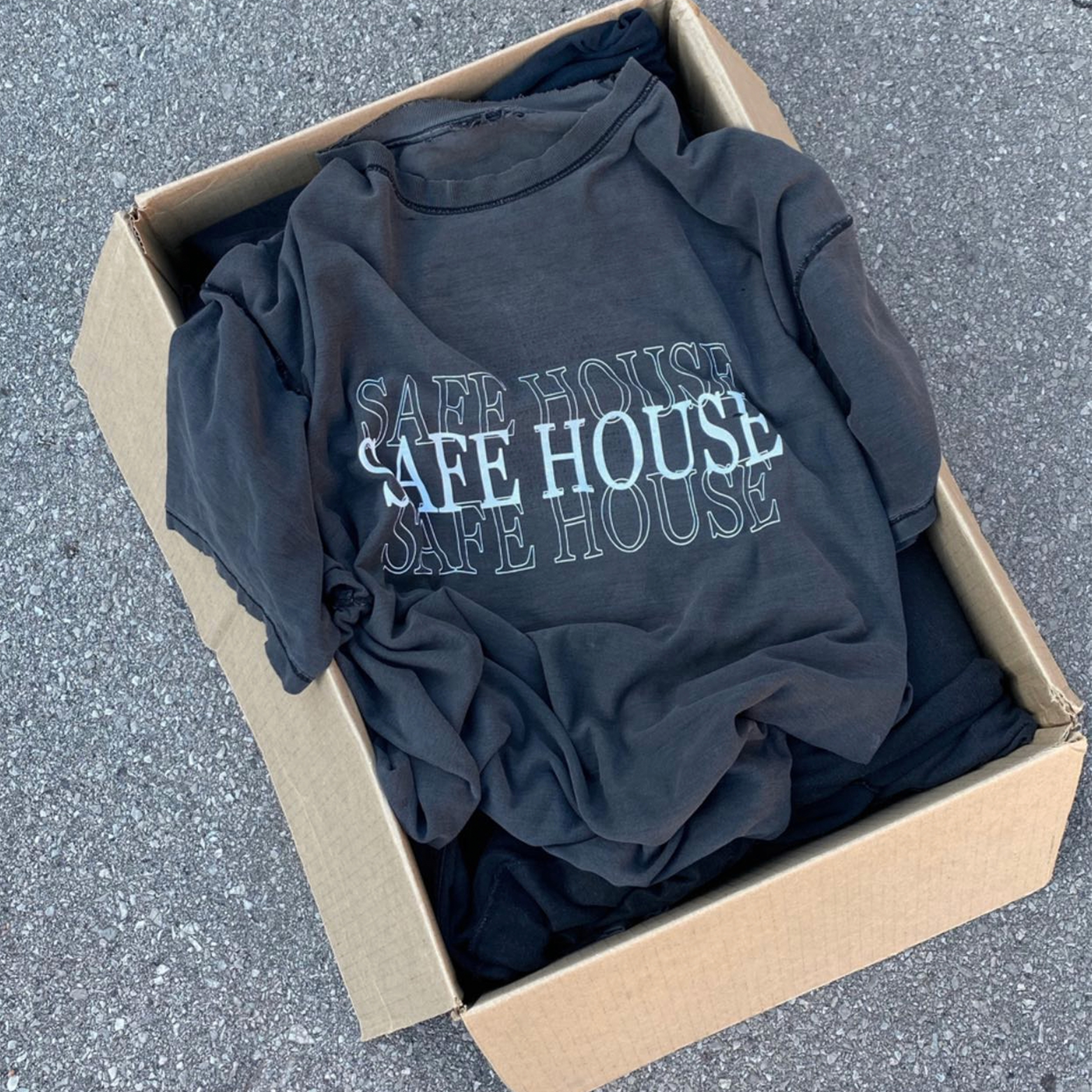
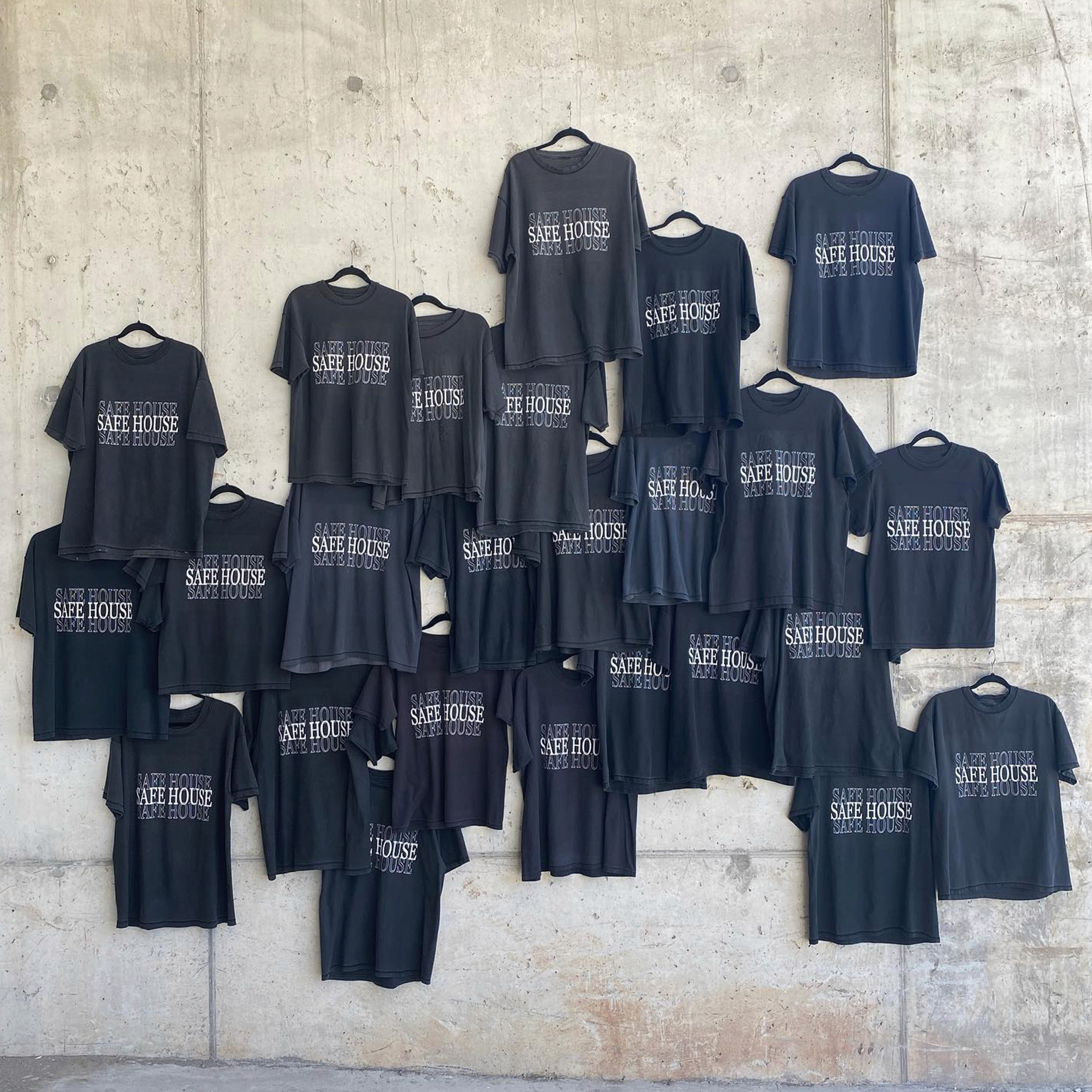
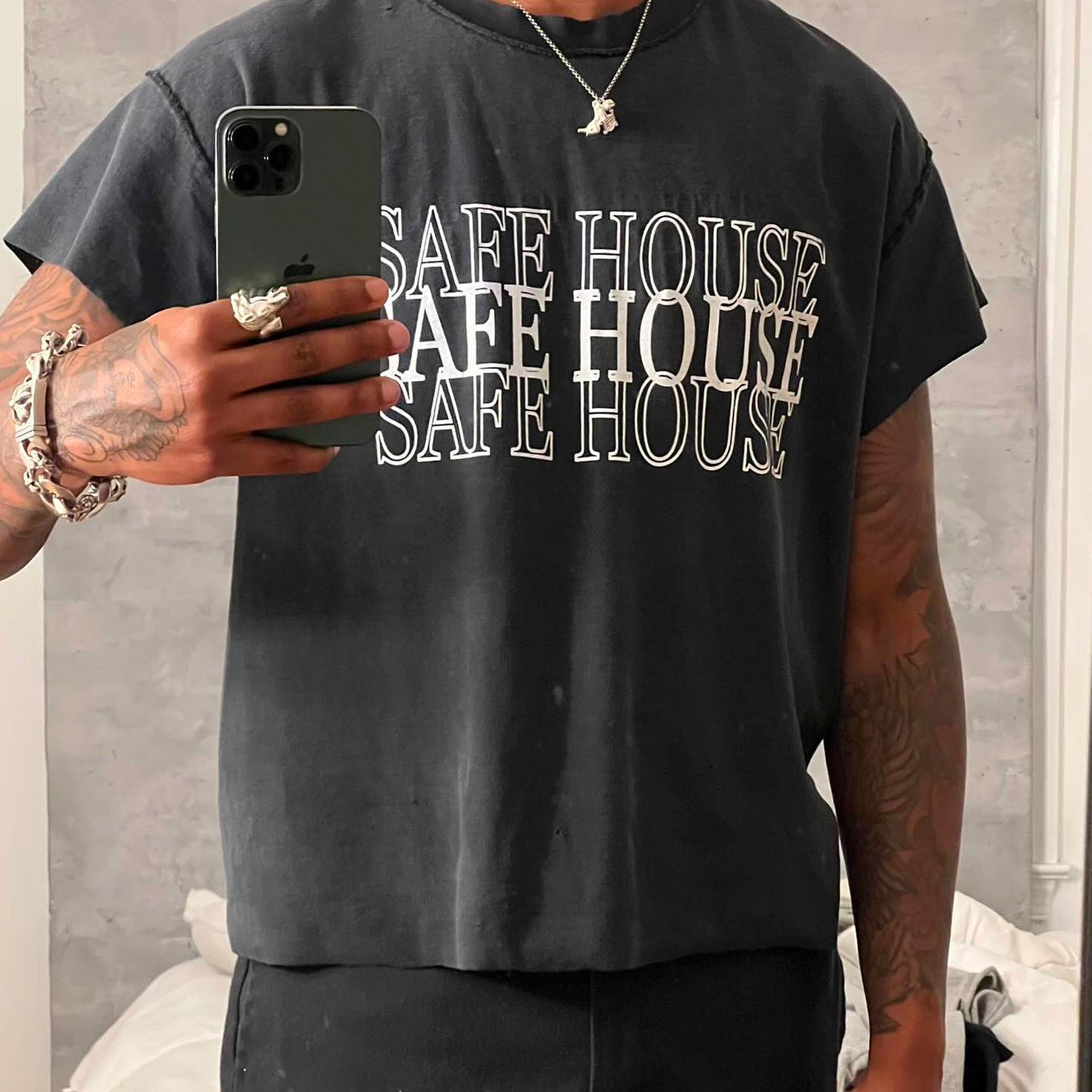
The Serif design highlights the duality of strength and subtlety within Safe House’s identity. Layered outlines of the word SAFE HOUSE create depth and rhythm, while the bold, centered fill brings clarity and focus. The use of classic serif typography ties the piece back to tradition, yet the overlapping layout pushes it into a more experimental, modern space.
It’s a simple but striking execution—balancing heritage-inspired lettering with a contemporary graphic approach that feels unmistakably Safe House.
Serif
Client
Safe House
Date
About
The Serif design highlights the duality of strength and subtlety within Safe House’s identity. Layered outlines of the word SAFE HOUSE create depth and rhythm, while the bold, centered fill brings clarity and focus. The use of classic serif typography ties the piece back to tradition, yet the overlapping layout pushes it into a more experimental, modern space.
It’s a simple but striking execution—balancing heritage-inspired lettering with a contemporary graphic approach that feels unmistakably Safe House.